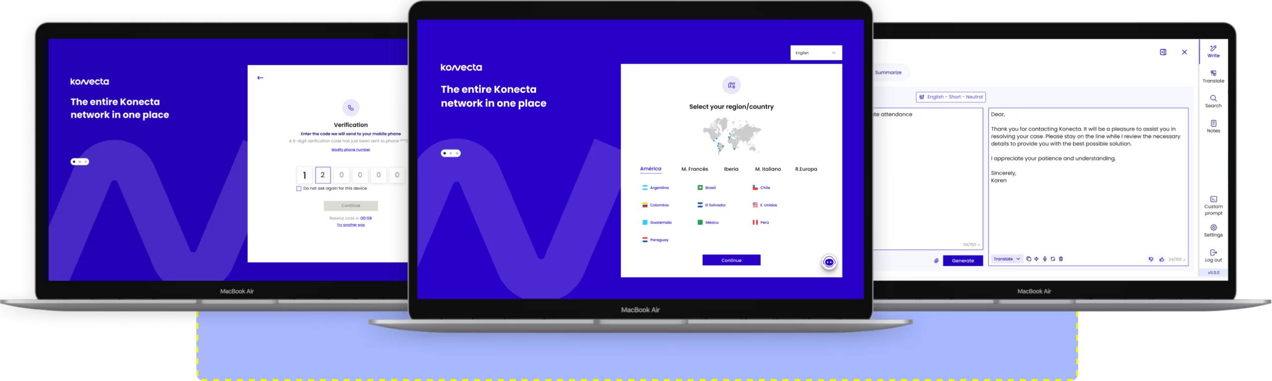
“This case study explores how, in collaboration between teams from Spain and Argentina, we unified criteria and optimised the experience across various products. Following a research process, we created an inventory of components and developed the first version of our design system, featuring over 60 reusable components. With clear principles, we ensured consistency, efficiency, and accessibility in interfaces applied in more than 8 countries.”
Encountering the issues and defining the scope of the solution.
Knowledge and understanding of the business reality.
Designing components, interactions, and prototypes, enhancing usability.
Support and guidance for the development teams.
Analysis of the results and proposal of iterations for continuous improvement.
Cohesion and continuity within the Konecta universe.
Consistent behaviours and aesthetics that reduce the learning curve for users.
An adaptable and evolving ecosystem in various contexts.
Coherence and quality in design.
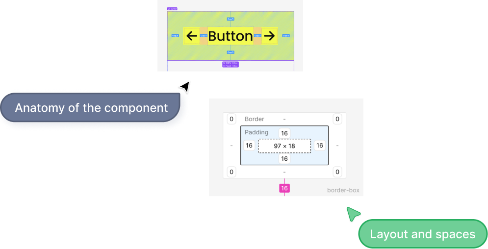
A solid foundation ensures visual consistency in the design, facilitates maintenance and scalability, and enhances collaboration with development through clear specifications and efficient updates.
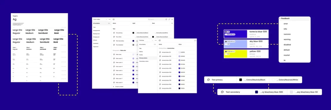
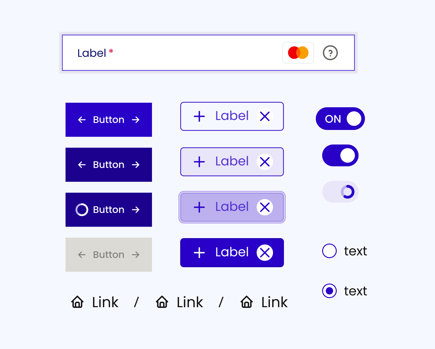
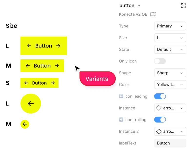
Each variant is configured with adjustable properties in Figma, ensuring flexibility, visual consistency, and efficient maintenance.
117 interconnected aliases were created for the components, allowing their variants to be displayed in Light / Dark Mode and defined brand customisations.
Buttons, inputs, checkboxes, radio buttons, cards, dropdowns, chips, toggles, grid and spacing.
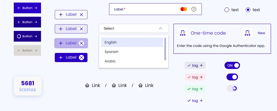
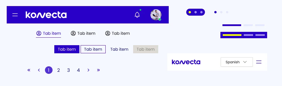
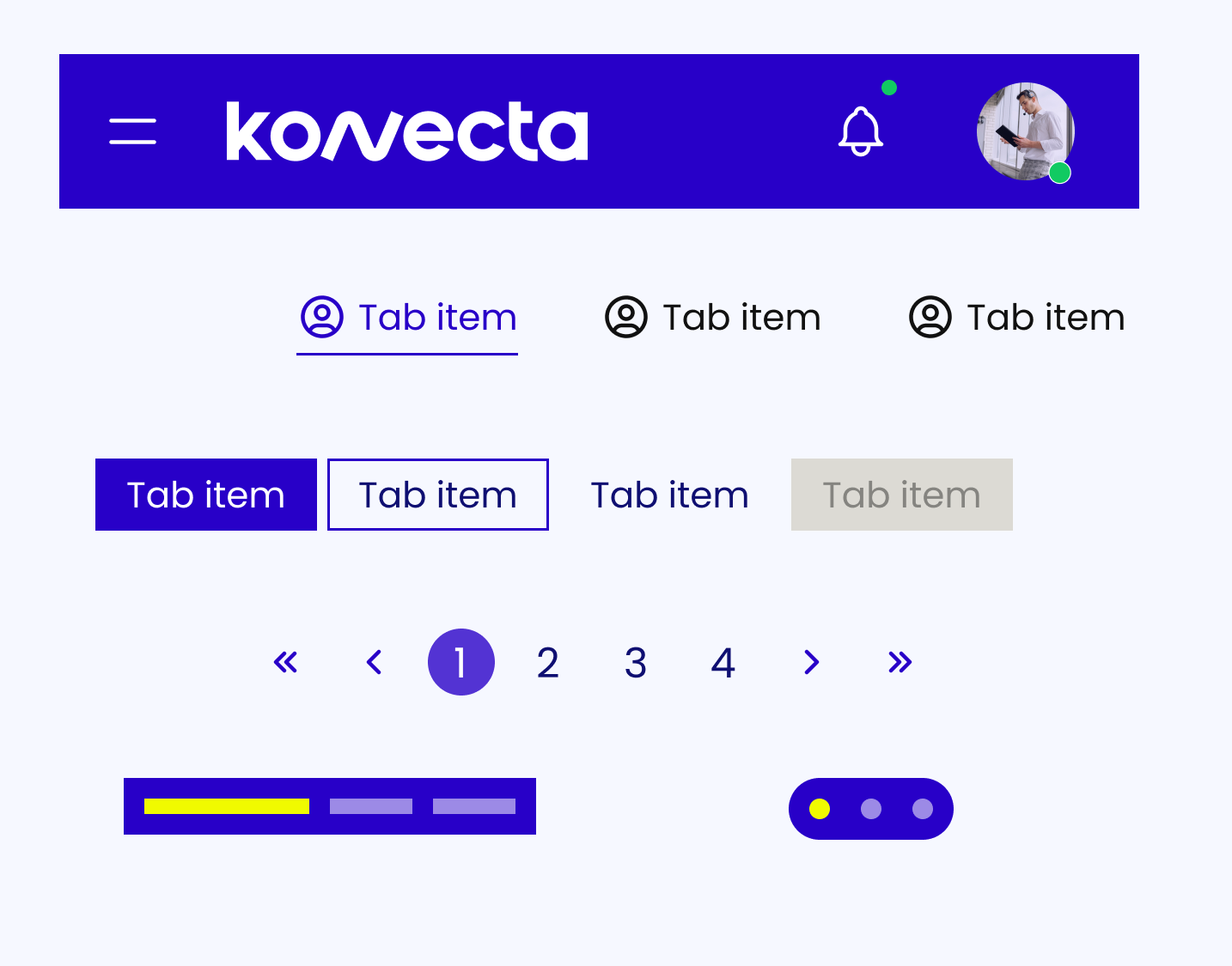
Navigation bars, tabs, dropdown menus, breadcrumbs, pagination.
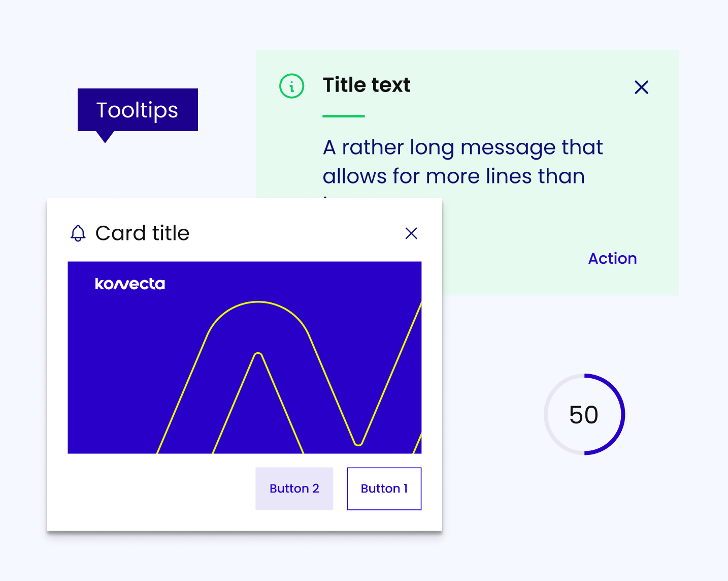
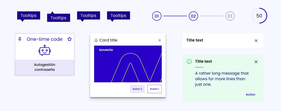
Notifications, tooltips, alerts, message banners, stepper, progress bar.
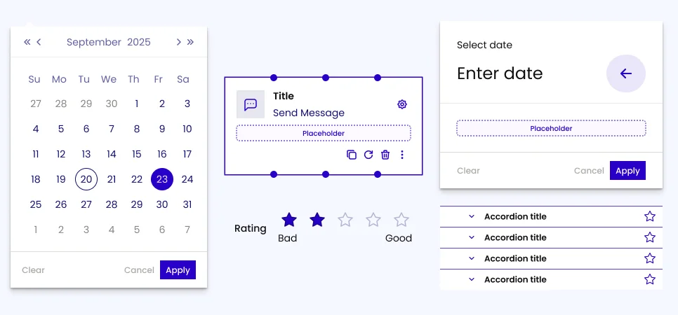
Sliders, carousels, date picker, time picker, date/time picker.
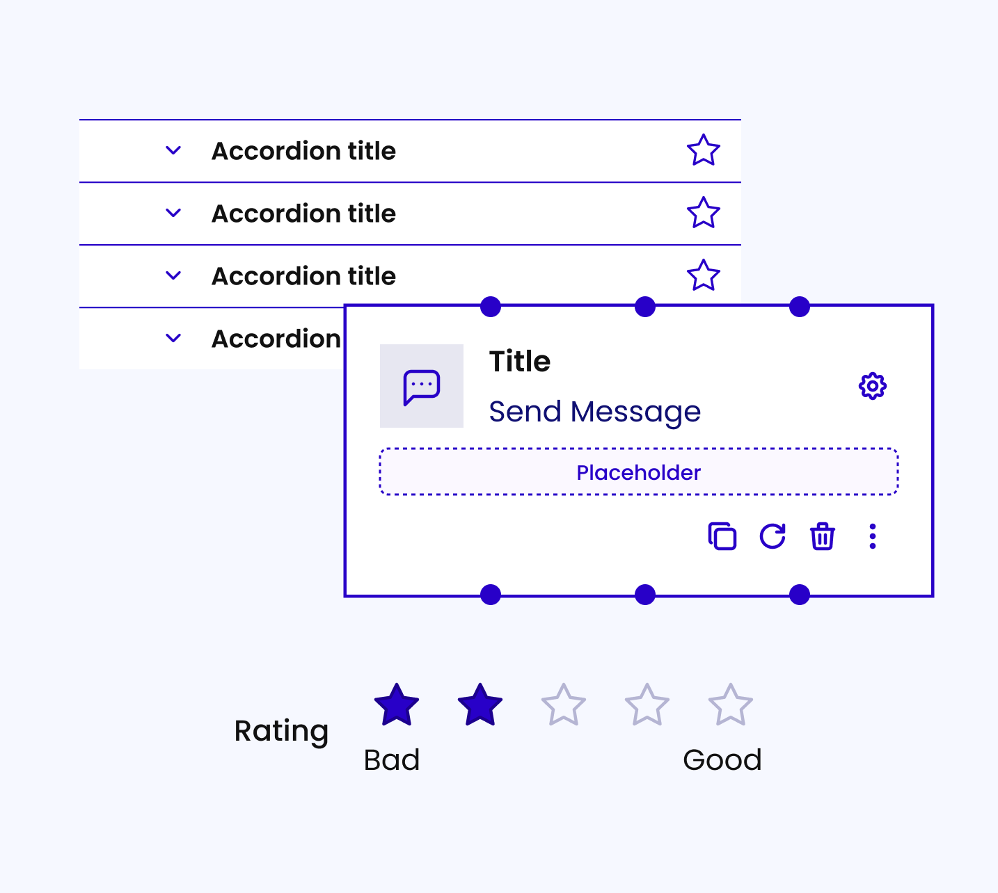
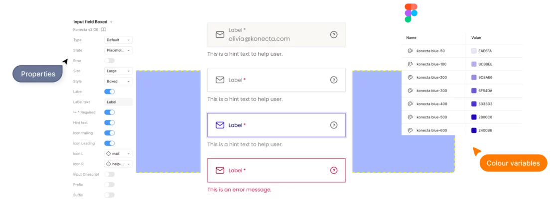
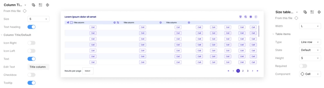
We inform about the use and variations of the components, including details such as size, colour, typography, and interactive behaviour. This ensures consistency and facilitates collaboration among team members.
We generate elements for implementation, including illustrations for errors, templates, and final screens. The aim is to ensure a consistent and efficient application of the design across different contexts, providing visual resources and practical guides for designers and developers.
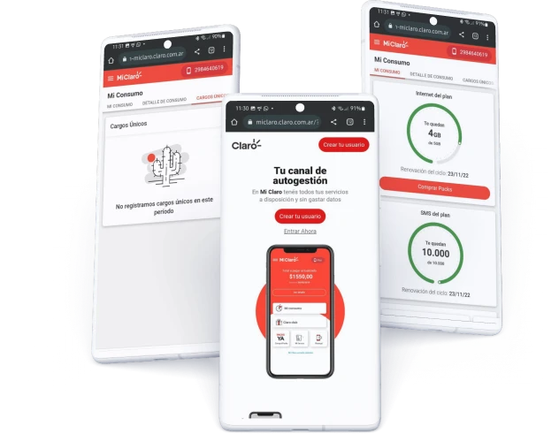
Messages accompanied by illustrations with the same aesthetic.
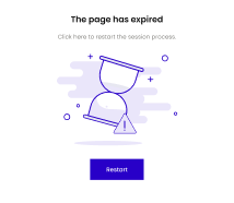
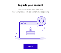
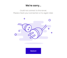
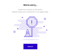
Messages accompanied by illustrations with the same aesthetic.
Every system is a long-term project; its implementation is a gradual process that must align with the business objectives and those of each team. It is crucial to plan its adoption in conjunction with the development teams and support them in its integration.

